Lecture 1 – Introduction and Transport Processes
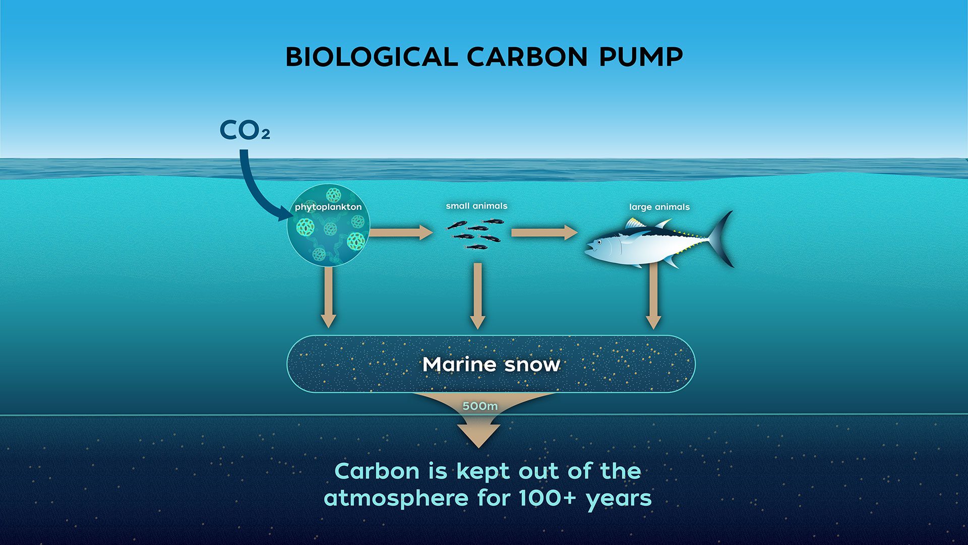
Biological Carbon Pump
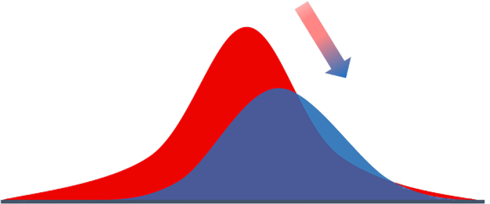
- Process where \( \mathrm{CO_2} \) from the atmosphere is absorbed by surface ocean phytoplankton through photosynthesis and transferred to deeper ocean layers via sinking organic particles
- The Biological Carbon Pump leads to an increase of \( \mathrm{DIC} \) in the ocean’s interior over the concentration that would result from only the solubility pump
- It regulates atmospheric \( \mathrm{CO_2} \) levels and influences Earth’s climate over geological timescales
The Solubility Pump
- Physical process of solving \(\mathrm{CO_2}\) in ocean water
- \(\mathrm{CO_2}\) and water react to form \(\mathrm{H_2CO_3}\) (carbonic acid)
- Since \(\mathrm{H_2CO_3}\) is a weak acid and has two \(\mathrm{H^+}\), it can act as a buffer
- 90% of dissolved inorganic carbon (DIC) is bicarbonate \(\mathrm{HCO_3^-}\)
Turbulence
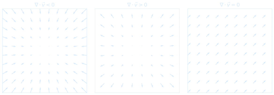
Reynolds-Averaged Navier-Stokes (RANS)
Reynolds averaging is quite easy to understand. It means decomposing a statistically observable quantity into an average part and a fluctuation part: $$ f = \overline{f} + f' $$ Since the flow is already unsteady at this point, we cannot guarantee that the value of the fluctuation is much smaller than the average part. The Navier–Stokes equation for incompressible flow can be written as: $$ \underbrace{\frac{\partial \vec{u}}{\partial t}}_{\text{Local acceleration}} + \underbrace{(\vec{u} \cdot \nabla) \vec{u}}_{\text{Advection}} = \underbrace{-\frac{1}{\rho} \nabla P}_{\text{Pressure force}} + \underbrace{g \vec{k}}_{\text{Gravity}} + \underbrace{\nu \nabla^2 \vec{u}}_{\text{Viscous diffusion}} $$ $g \vec{k}$ with typically $ \vec{k} = \begin{pmatrix} 0 \\ 0 \\ 1 \end{pmatrix} $ defines gravity as a vector field acting downward (if you use $-g \vec{k}$, then $\vec{k}$ points upward) For any field variable (velocity $\vec{u}$, pressure $P$, or scalar tracer $T$), we decompose it into a mean and a fluctuating part: $$ \vec{u} = \bar{\vec{u}} + \vec{u}' \quad \text{and} \quad P = \bar{P} + P' \quad \text{and} \quad T = \bar{T} + T' $$ Where:- $\bar{\vec{u}}$: time-averaged (mean) velocity
- $\vec{u}'$: turbulent fluctuation (zero mean: $\overline{\vec{u}'} = 0$)
- Similarly for $P$ and $T$
So the Reynolds-averaged Navier–Stokes (RANS) equation becomes: $$ \frac{\partial \bar{\vec{u}}}{\partial t} + (\bar{\vec{u}} \cdot \nabla)\bar{\vec{u}} = -\frac{1}{\rho} \nabla \bar{P} + g\vec{k} + \nu \nabla^2 \bar{\vec{u}} - \nabla \cdot \overline{\vec{u}' \vec{u}'} $$ The term $-\nabla \cdot \overline{\vec{u}' \vec{u}'}$ is the turbulent momentum transport, and it leads directly to the turbulence closure problem.
The Tracer Equation
Take a scalar quantity like temperature $T$, salinity, or concentration $C$, governed by the advection-diffusion equation: $$ \frac{\partial T}{\partial t} + \vec{u} \cdot \nabla T = k \nabla^2 T + S $$ The $S$ in the equation above means source, it can be tracer such as heating H, DIC, etc.Apply Reynolds decomposition: $T = \bar{T} + T'$, $\vec{u} = \bar{\vec{u}} + \vec{u}'$, and average the equation: $$ \overline{\frac{\partial T}{\partial t}} + \overline{(\vec{u} \cdot \nabla T)} = k \nabla^2 \bar{T} + \bar{S} $$ That gives: $$ \frac{\partial \bar{T}}{\partial t} + \bar{\vec{u}} \cdot \nabla \bar{T} + \nabla \cdot \overline{\vec{u}' T'} = k \nabla^2 \bar{T} + \bar{S} $$ Substituting turbulent closure: $$ \frac{\partial \bar{T}}{\partial t} + \bar{\vec{u}} \cdot \nabla \bar{T} = \left( k + k_{\text{turb}} \right) \nabla^2 \bar{T} + \bar{S} $$ Or compactly: $$ T_t = -\vec{u} \cdot \nabla T + (k + k_{\text{turb}}) \nabla^2 T + S $$ Which is exactly your final boxed form: $$ T_t = -\vec{u} \cdot \nabla T + k_{\text{turb}} \nabla^2 T + S $$ In 3D Cartesian coordinates:
- $T(x, y, z, t)$: scalar field (e.g. temperature)
- $\vec{u} = (u, v, w)$: velocity components in $x, y, z$
- $\nabla T = \left( \frac{\partial T}{\partial x}, \frac{\partial T}{\partial y}, \frac{\partial T}{\partial z} \right)$
- $\nabla^2 T = \frac{\partial^2 T}{\partial x^2} + \frac{\partial^2 T}{\partial y^2} + \frac{\partial^2 T}{\partial z^2}$
Tracer-Equation after Reynolds averaging: \(\boxed{T_t = - \mathbf{u} \cdot \nabla T + k_{turb} \cdot \nabla^2 T + S(\text{source})}\)
\(k_{turb}\) = turbulent diffusivity (depends on size and strength of waves or eddies)
import numpy as np
import matplotlib.pyplot as plt
from tqdm import tqdm
import imageio.v3 as iio
import os
# Parameters
nx, ny = 50, 50
dx, dy = 1.0, 1.0
dt = 0.01
k = 0.1
nt = 500
u = 1.0
d = 0.5
# Grid
x = np.linspace(0, (nx-1)*dx, nx)
y = np.linspace(0, (ny-1)*dy, ny)
X, Y = np.meshgrid(x, y, indexing='ij')
# Initial tracer field
T_initial = np.exp(-((X-25)**2 + (Y-25)**2)/50)
S = np.zeros((nx, ny))
S[20:30, 20:30] = 0.1
# Laplacian
def laplacian(T, dx, dy):
return (
(np.roll(T, -1, axis=0) - 2*T + np.roll(T, 1, axis=0)) / dx**2 +
(np.roll(T, -1, axis=1) - 2*T + np.roll(T, 1, axis=1)) / dy**2
)
# Boundary conditions
def apply_boundary_conditions(T):
T[0, :] = T[1, :]
T[-1, :] = T[-2, :]
T[:, 0] = T[:, 1]
T[:, -1] = T[:, -2]
return T
# Precompute frames
T_advect_list, T_diffuse_list, T_source_list, T_full_list = [], [], [], []
T_advect = T_initial.copy()
T_diffuse = T_initial.copy()
T_source = T_initial.copy()
T_full = T_initial.copy()
for n in tqdm(range(nt), desc="Precomputing frames"):
# Advection
dTdx = (np.roll(T_advect, -1, axis=0) - np.roll(T_advect, 1, axis=0)) / (2*dx)
dTdy = (np.roll(T_advect, -1, axis=1) - np.roll(T_advect, 1, axis=1)) / (2*dy)
advect = -(u * dTdx + d * dTdy)
T_advect += dt * advect
T_advect = apply_boundary_conditions(T_advect)
T_advect_list.append(T_advect.copy())
# Diffusion
diffuse = k * laplacian(T_diffuse, dx, dy)
T_diffuse += dt * diffuse
T_diffuse = apply_boundary_conditions(T_diffuse)
T_diffuse_list.append(T_diffuse.copy())
# Source
T_source += dt * S
T_source = apply_boundary_conditions(T_source)
T_source_list.append(T_source.copy())
# Full
dTdx_full = (np.roll(T_full, -1, axis=0) - np.roll(T_full, 1, axis=0)) / (2*dx)
dTdy_full = (np.roll(T_full, -1, axis=1) - np.roll(T_full, 1, axis=1)) / (2*dy)
advect_full = -(u * dTdx_full + d * dTdy_full)
diffuse_full = k * laplacian(T_full, dx, dy)
T_full += dt * (advect_full + diffuse_full + S)
T_full = apply_boundary_conditions(T_full)
T_full_list.append(T_full.copy())
# Save frames as images
if not os.path.exists('frames'):
os.makedirs('frames')
fig, axes = plt.subplots(2, 2, figsize=(14, 10), facecolor='none')
titles = ['Advection Only', 'Diffusion Only', 'Source Only', 'Full Model']
pcm_list = []
for ax, title in zip(axes.flat, titles):
pcm = ax.pcolormesh(X, Y, np.zeros_like(T_initial), shading='nearest', cmap='coolwarm', vmin=0, vmax=1)
ax.set_title(title, color='#d6ebff')
ax.set_xlabel('x', color='#d6ebff')
ax.set_ylabel('y', color='#d6ebff')
ax.set_facecolor('none')
ax.tick_params(colors='#d6ebff')
for spine in ax.spines.values():
spine.set_edgecolor('#d6ebff')
pcm_list.append(pcm)
fig.patch.set_alpha(0.0)
# Add colorbar
cbar_ax = fig.add_axes([0.92, 0.15, 0.02, 0.7])
cbar = fig.colorbar(pcm_list[-1], cax=cbar_ax)
cbar.set_label('Tracer Concentration', color='#d6ebff')
cbar.ax.yaxis.set_tick_params(color='#d6ebff')
plt.setp(plt.getp(cbar.ax.axes, 'yticklabels'), color='#d6ebff')
filenames = []
for i in tqdm(range(nt), desc='Saving frames'):
fields = [T_advect_list[i], T_diffuse_list[i], T_source_list[i], T_full_list[i]]
for pcm, T in zip(pcm_list, fields):
pcm.set_array(T.ravel())
fname = f'frames/frame_{i:04d}.png'
plt.savefig(fname, dpi=100, transparent=True)
filenames.append(fname)
plt.close()
# Create GIF from saved frames
print('Creating GIF...')
frames = [iio.imread(fname) for fname in filenames]
iio.imwrite('Lecture1_TracerFieldEvolution.gif', frames, duration=1/30, loop=0) # 30 fps, infinite replay
# Clean up
for fname in filenames:
os.remove(fname)
os.rmdir('frames')
print("Saved as transparent tracer_evolution.gif!")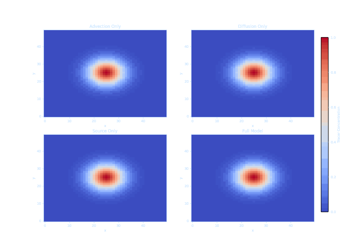 It should be noted that we can’t solve $\overline{\vec{u}' T'}$ directly — this is the turbulence closure problem.
So we use an eddy diffusivity model (Prandtl 1926):
$$
\overline{u'_i T'} \approx -k_t \frac{\partial \bar{T}}{\partial x_i}
$$
This is like Fick’s Law, where turbulent transport is down the gradient.
It should be noted that we can’t solve $\overline{\vec{u}' T'}$ directly — this is the turbulence closure problem.
So we use an eddy diffusivity model (Prandtl 1926):
$$
\overline{u'_i T'} \approx -k_t \frac{\partial \bar{T}}{\partial x_i}
$$
This is like Fick’s Law, where turbulent transport is down the gradient.
Dissolved Inorganic carbonate
The total concentration of carbon in dissolved inorganic form in seawater, referred to as dissolved inorganic carbon (DIC), is defined as the sum of the concentrations of the three carbonate species: $$ \text{DIC} = [\mathrm{CO}_2^*] + [\mathrm{HCO}_3^-] + [\mathrm{CO}_3^{2-}] $$ Surface observations reveal comparable values of DIC, varying from less than 2000 $\mu\text{mol kg}^{-1}$ in the tropics to more than 2100 $\mu\text{mol kg}^{-1}$ in the high latitudes. Most of the surface DIC is accounted for by $[\text{HCO}_3^-]$, followed by $[\text{CO}_3^{2-}]$, while $[\text{CO}_2^*]$ accounts for less than 1%. The patterns of DIC and its carbon components are not identical over the globe: there is a general increase in DIC, $[\text{HCO}_3^-]$ and $[\text{CO}_2^*]$ with latitude, but an opposing decrease in $[\text{CO}_3^{2-}]$.Bonus: Rubber Ducks Used as Tracers
 We can model the ducks as ‘tracer particles’ in the ocean.
The term ‘tracer particles’ refers to small objects that move with a fluid without really changing how it behaves.
They are very common: examples include leaves on the surface of a river and, fortunately, rubber ducks in the ocean.
We can do simulations that try to track the amount of these particles in different parts of the ocean.
We can model the ducks as ‘tracer particles’ in the ocean.
The term ‘tracer particles’ refers to small objects that move with a fluid without really changing how it behaves.
They are very common: examples include leaves on the surface of a river and, fortunately, rubber ducks in the ocean.
We can do simulations that try to track the amount of these particles in different parts of the ocean.Reference: Ocean spills
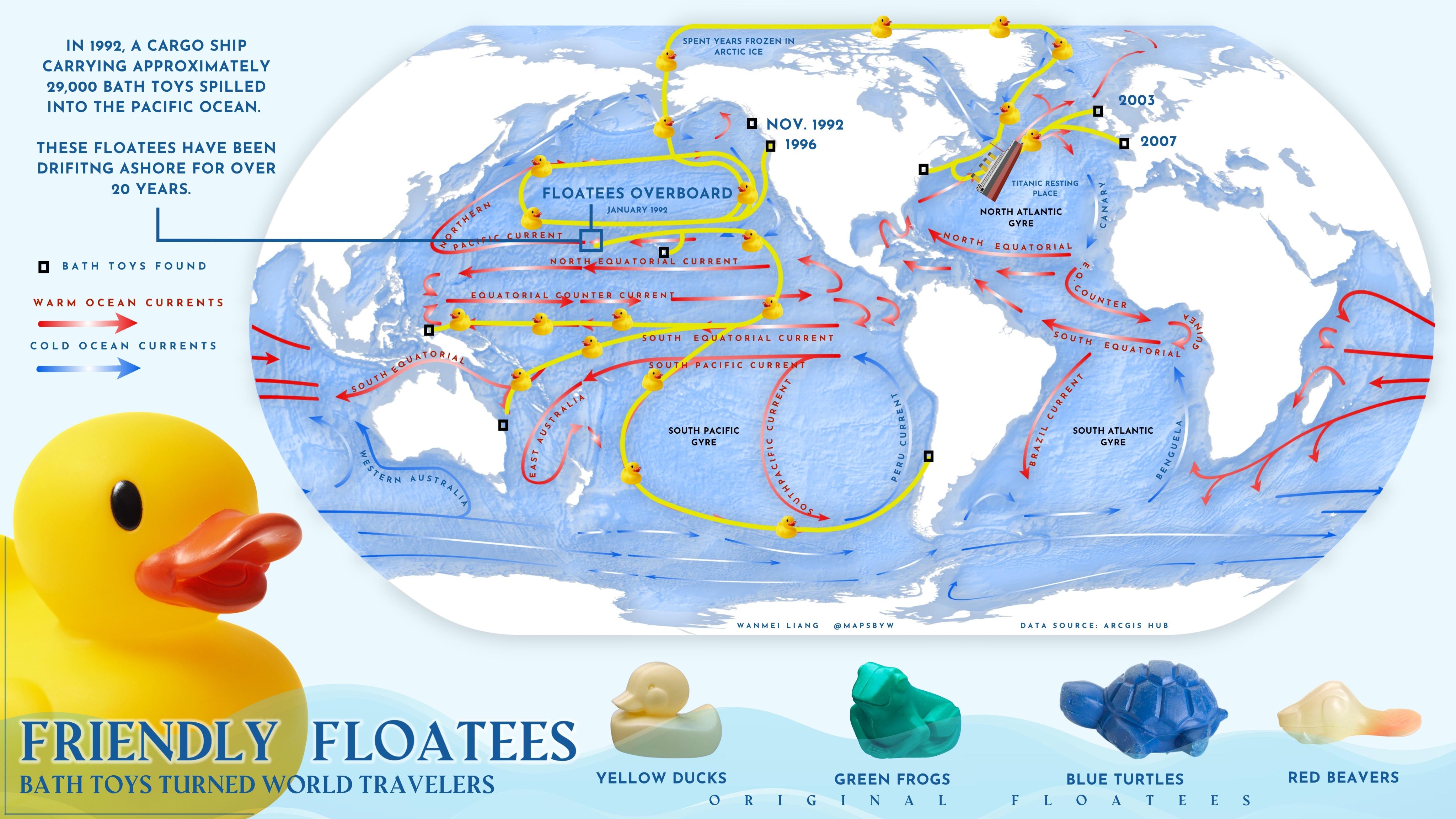
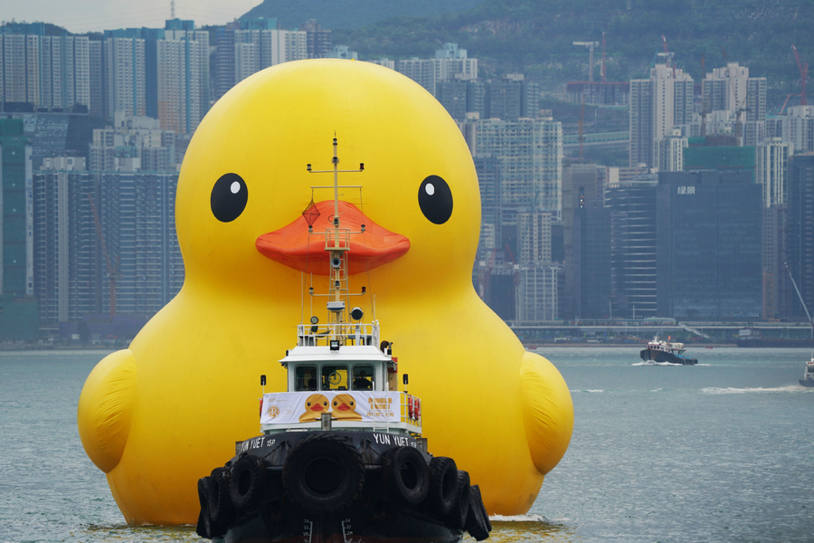
Any floating object can serve as a makeshift drift meter, as long as it is known where the object entered the ocean and where it was retrieved. The path of the object can then be inferred, providing information about the movement of surface currents. If the time of release and retrieval are known, the speed of currents can also be determined. Oceanographers have long used drift bottles (a floating “message in a bottle” or a radio-transmitting device set adrift in the ocean) to track the movement of currents. Many objects have inadvertently become drift meters when ships lose cargo at sea. In January 1992, a shipping mishap turned into an unexpected scientific breakthrough when the cargo ship Ever Laurel lost a container carrying 29,000 plastic toys—mostly rubber ducks—into the Pacific Ocean.
Autocorrelation
Many climate data contain autocorrelation, we often can’t avoid it.
Autocovariance Function (ACF)The autocovariance function \(\gamma(\tau)\) is the covariance of a time series with itself
at another time by a time lag (or lead) \(\tau\). For a time series \(x(t)\)
with \(t_1\) and \(t_N\) as the starting and end points of the time series, \(x'(t)\) means remove the mean → it's the anomaly at time \(t\), the ACF is defined as:
\[
\gamma(\tau) = \frac{1}{(t_N - \tau) - t_1} \sum_{t = t_1}^{t_N - \tau} x'(t) \cdot x'(t + \tau)
\]
At lag \(\tau = 1\), assuming \(t_1 = 0\), \(t_N = N\):
\[
\gamma(1) = \frac{1}{N - 1} \left( x'(0) \cdot x'(1) + x'(1) \cdot x'(2) + x'(2) \cdot x'(3) + \dots + x'(N - 1) \cdot x'(N) \right)
\]
At lag \(\tau = 2\):
\[
\gamma(2) = \frac{1}{N - 2} \left( x'(0) \cdot x'(2) + x'(1) \cdot x'(3) + x'(2) \cdot x'(4) + \dots + x'(N - 2) \cdot x'(N) \right)
\]
At lag \(\tau = N - 1\):
\[
\gamma(N - 1) = x'(0) \cdot x'(N - 1) + x'(1) \cdot x'(N)
\]
At lag \(\tau = 0\):
\[
\gamma(0) = \overline{x'^2} = \text{variance}
\]
[Pf] Using Mathematical Induction,
Base Case \(\tau = 0\): \(\gamma(0) = \frac{1}{N} \sum_{t=0}^{N - 1} x'(t) \cdot x'(t) = \frac{1}{N} \sum_{t=0}^{N - 1} (x'(t))^2\)
Assume the formula holds for arbitrary \(k\), where \(0 \leq k < N - 1\):
\(
\gamma(k) = \frac{1}{N - k} \sum_{t=0}^{N - k - 1} x'(t) \cdot x'(t + k)
\)
\(\Rightarrow \gamma(k + 1) = \frac{1}{N - (k + 1)} \sum_{t = 0}^{N - (k + 1) - 1} x'(t) \cdot x'(t + k + 1)
= \frac{1}{N - k - 1} \sum_{t = 0}^{N - k - 2} x'(t) \cdot x'(t + k + 1)\)
\(\Rightarrow \gamma(\tau) = \frac{1}{N - \tau} \sum_{t=0}^{N - \tau - 1} x'(t) \cdot x'(t + \tau)
\quad \forall\ \tau \in [0, N - 1]\)
\(\because\) The total length is \(t_N - t_1 + 1\), \( t + \tau \leq t_N \Rightarrow t \leq t_N - \tau\)
\(\therefore \boxed{\gamma(\tau) = \frac{1}{(t_N - \tau) - t_1} \sum_{t = t_1}^{t_N - \tau} x'(t) \cdot x'(t + \tau)}\)
def autocovariance(x, lag):
    x = np.asarray(x)
    x_mean = np.mean(x)
    N = len(x)
return np.sum((x[:N-lag] - x_mean) * (x[lag:] - x_mean)) / (N - lag)np.correlate() function that computes the cross-correlation of two 1-dimensional sequences.
It should be noticed that the definition of correlation above is not unique and sometimes correlation may be defined differently,
the np.correlate() function uses \(c(\tau) = \sum_{t = t_1}^{t_N - \tau} x(t + \tau) \cdot \bar{y}(t)
\) to compute the autocovariance and does not include the
\(
\frac{1}{(t_N - \tau) - t_1}
\) factor, so we have to make some adjustments to convert to autocorrelation.
The autocorrelation \(\rho(\tau)\) is defined as the normalized autocovariance:\[ \rho(\tau) = \frac{\gamma(\tau)}{\gamma(0)} \]This gives the autocovariance at lag \(\tau\) divided by the variance of the time series, yielding a value between \(-1\) and \(1\).
def autocorrelation(x, lag):
    x = np.asarray(x)
    x_mean = np.mean(x)
    x_var = np.var(x)
    N = len(x)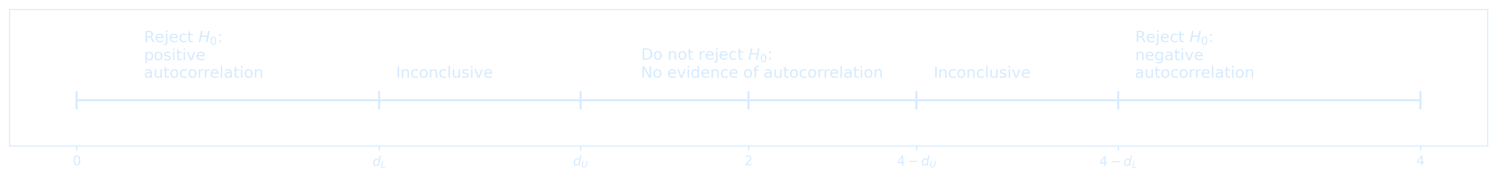
return np.sum((x[:N-lag] - x_mean) * (x[lag:] - x_mean)) / ((N - lag) * x_var)The Durbin-Watson test statistic assesses the autocorrelation of residuals in a regression, it is defined as: \[ DW = \frac{\sum_{t=2}^{T} (e_t - e_{t-1})^2}{\sum_{t=1}^{T} e_t^2} \]The null hypothesis of the test is that there is no serial correlation in the residuals.The test statistic is approximately equal to \( 2 \cdot (1 - r) \), where \( r \) is the sample autocorrelation of the residuals. For \( r = 0 \), there is no serial correlation, the test statistic equals 2. This statistic will always be between 0 and 4
- The closer to 0, the more evidence for positive serial correlation (residuals persist)
- The closer to 4, the more evidence for negative serial correlation (residuals alternate)
Anomaly Calculation
An anomaly is the difference between an actual value and some long-term average value. Anomalies can be computed by removing the mean \[ x' = x - \bar{x} \] This isolates deviations from the mean and highlights variability around a baseline.
x = series - np.mean(series)ENSO (El Niño-Southern Oscillation) is a periodic fluctuation (every 2–7 years) in wind and sea surface temperature over the tropical eastern Pacific Ocean. It affects the global climate and is a major driver of Earth's interannual climate variability, causing various climate anomalies. Using the ENSO-related standardized monthly climate data (1950–2024) available on Kaggle, some examples of autocorrelation can be illustrated.
Take a quick look at the actual structure of ENSO.csv first
import pandas as pd

df = pd.read_csv('ENSO.csv', header=None)

# Show shape and first few rows
print("Shape of the file:", df.shape)
print(df.head())
Shape of the file: (883, 22)
0     1      2                             3             4   \
0      Date  Year  Month  Global Temperature Anomalies  Nino 1+2 SST
1  1/1/1950  1950    JAN                          -0.2           NaN
2  2/1/1950  1950    FEB                         -0.26           NaN
3  3/1/1950  1950    MAR                         -0.08           NaN
4  4/1/1950  1950    APR                         -0.16           NaN

              5           6                     7             8   \
0  Nino 1+2 SST Anomalies  Nino 3 SST  Nino 3 SST Anomalies  Nino 3.4 SST
1                     NaN         NaN                   NaN           NaN
2                     NaN         NaN                   NaN           NaN
3                     NaN         NaN                   NaN           NaN
4                     NaN         NaN                   NaN           NaN

              9   ...     12     13   14   15                16  \
0  Nino 3.4 SST Anomalies  ...    TNI    PNA  OLR  SOI  Season (2-Month)
1                     NaN  ...  0.624  -3.65  NaN  NaN                DJ
2                     NaN  ...  0.445  -1.69  NaN  NaN                JF
3                     NaN  ...  0.382  -0.06  NaN  NaN                FM
4                     NaN  ...  0.311  -0.23  NaN  NaN                MA

17                18    19                 20                    21
0  MEI.v2  Season (3-Month)   ONI  Season (12-Month)  ENSO Phase-Intensity
1     NaN               DJF  -1.5          1950-1951                    ML
2     NaN               JFM  -1.3          1950-1951                    ML
3     NaN               FMA  -1.2          1950-1951                    ML
4     NaN               MAM  -1.2          1950-1951                    ML

[5 rows x 22 columns]
The primary indicators for ENSO are ONI (Oceanic Niño Index) and MEI.v2. ONI is the 3-month average SST anomaly in the Nino 3.4 region, it is the preferred indicator by NOAA. To be considered an El Niño/La Niña event, the SST anomalies in the Nino 3.4 region must meet the following criteria and remain at or above/below these levels for a minimum of five consecutive months
- El Niño → anomalies at or above +0.5°C
- La Niña → anomalies at or below -0.5°C
- Neutral → anomalies between -0.5°C and +0.5°C
The threshold is further divided into:
- Weak → 0.5°C to 0.9°C SST anomaly
- Moderate → 1.0°C to 1.4°C
- Strong → 1.5°C to 1.9°C
- Very Strong → ≥ 2.0°C
import pandas as pd
import matplotlib.pyplot as plt
import matplotlib
import matplotlib.dates as mdates
import numpy as np
from matplotlib.colors import Normalize
from matplotlib.cm import get_cmap, ScalarMappable

# Load CSV with no header, and use row 0 as column names
df = pd.read_csv('ENSO.csv', header=0)

# Convert 'Date' column (column 0) to datetime
df['Date'] = pd.to_datetime(df['Date'], errors='coerce')
df = df.dropna(subset=['Date'])  # Drop rows where date couldn't be parsed
df.set_index('Date', inplace=True)

# Convert ONI column to numeric
df['ONI'] = pd.to_numeric(df['ONI'], errors='coerce')
df = df.dropna(subset=['ONI'])

# Extract time and ONI
dates = df.index
oni = df['ONI'].values

# Create colormap and normalization
cmap = get_cmap('coolwarm')
norm = Normalize(vmin=oni.min(), vmax=oni.max())  # Based on ONI value range, or other ways

# Plot setup
fig, ax = plt.subplots(figsize=(15, 5), dpi=300)
fig.patch.set_alpha(0.0)
ax.set_facecolor('none')

# Plot ONI with gradient line
for i in range(len(oni) - 1):
    ax.plot(dates[i:i+2], oni[i:i+2],
            color=cmap(norm(oni[i])), linewidth=2)

# Add color bar
sm = ScalarMappable(norm=norm, cmap=cmap)
sm.set_array([])
cbar = fig.colorbar(sm, ax=ax, pad=0.02)
cbar.set_label('ONI Value', color='#d6ebff')
cbar.ax.yaxis.set_tick_params(color='#d6ebff')
plt.setp(plt.getp(cbar.ax.axes, 'yticklabels'), color='#d6ebff')

# Horizontal ENSO thresholds
x = matplotlib.dates.date2num(dates)
levels = [
    (2.0, 'very strong', 'red'),
    (1.5, 'strong', 'red'),
    (1.0, 'moderate', 'red'),
    (0.5, 'weak', 'red'),
    (-0.5, 'weak', 'blue'),
    (-1.0, 'moderate', 'blue'),
    (-1.5, 'strong', 'blue'),
]

for level, label, color in levels:
    ax.axhline(y=level, color=color, linestyle=':', linewidth=1)
    ax.text(x[-1], level, f'    {label}', color=color, va='center')

# Custom legend
line_red = matplotlib.lines.Line2D([0], [0], label='El Niño (ONI > 0.5)', color='red')
line_blue = matplotlib.lines.Line2D([0], [0], label='La Niña (ONI < -0.5)', color='blue')
legend = ax.legend(handles=[line_red, line_blue])

# Style legend text
for text in legend.get_texts():
    text.set_color('#d6ebff')

# Axes labels and title
ax.set_xlabel("Years", color="#d6ebff")
ax.set_ylabel("ONI", color="#d6ebff")
ax.set_title("ENSO and ONI Relation", fontsize=14, color="#d6ebff")

# Axis ticks and spines
ax.tick_params(colors="#d6ebff")
for label in ax.get_xticklabels():
    label.set_color('#d6ebff')
for label in ax.get_yticklabels():
    label.set_color('#d6ebff')
for spine in ax.spines.values():
    spine.set_color("#d6ebff")

# Grid
ax.grid(True, linestyle='--', linewidth=0.5, color='#3c5c78', alpha=0.5)

plt.tight_layout()
plt.show()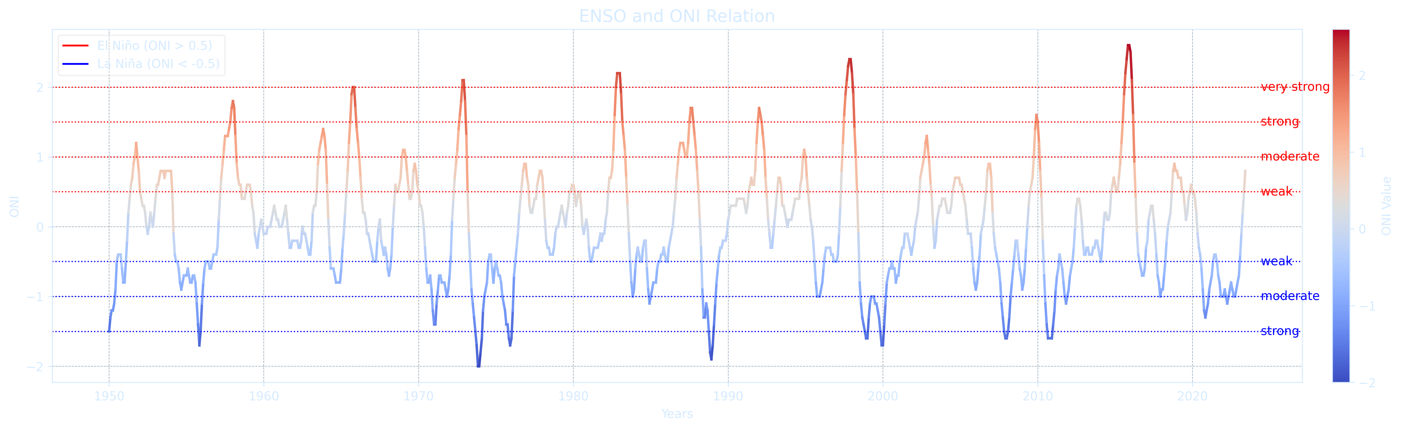
Loop through all numeric variables in ENSO.csv, apply seasonal averaging and detrend each with a linear fit, compute the residual autocorrelation, and rank the variables by their Durbin-Watson statistic.
import numpy as np
import pandas as pd
from statsmodels.stats.stattools import durbin_watson
from scipy import stats

# Load dataset
df = pd.read_csv('ENSO.csv')

# Filter numeric variables only
numeric_cols = df.select_dtypes(include='number').columns

results = []

for var in numeric_cols:
    series = df[var].dropna().values
    if len(series) < 120:  # skip very short or incomplete variables
        continue
    series = series[:(len(series) // 3) * 3]  # trim to full seasons
    seasonal = np.mean(series.reshape(-1, 3), axis=1)
    time = np.arange(len(seasonal))

    # Trend and residuals
    trend = np.polyval(np.polyfit(time, seasonal, 1), time)
    residuals = seasonal - trend

    # Durbin-Watson test on residuals
    dw = durbin_watson(residuals)
    results.append((var, dw))

# Sort by closeness to DW = 2 (least autocorrelated)
results_sorted_by_distance = sorted(results, key=lambda x: abs(x[1] - 2))

# Sort by actual DW value (to show most autocorrelated: smallest DWs)
results_sorted_by_value = sorted(results, key=lambda x: x[1])

# Show least autocorrelated
print("\nTop 5 least autocorrelated (residuals):")
for name, dw in results_sorted_by_distance[:5]:
    print(f"{name:30s}  DW: {dw:.3f}")

# Show most autocorrelated
print("\nTop 5 most autocorrelated (residuals):")
for name, dw in results_sorted_by_distance[-5:][::-1]:
    print(f"{name:30s}  DW: {dw:.3f}")
        Top 5 least autocorrelated (residuals):
        PNA                             DW: 1.678
        Nino 1+2 SST                    DW: 1.668
        Year                            DW: 2.386
        Nino 3 SST                      DW: 1.209
        Nino 3.4 SST                    DW: 0.813

        Top 5 most autocorrelated (residuals):
        Nino 4 SST Anomalies            DW: 0.349
        TNI                             DW: 0.354
        ONI                             DW: 0.369
        MEI.v2                          DW: 0.405
        Nino 3.4 SST Anomalies          DW: 0.425
import numpy as np
import pandas as pd
import matplotlib.pyplot as plt
from scipy import stats
from statsmodels.stats.stattools import durbin_watson

# --- Load dataset and scan numeric variables ---
df = pd.read_csv('ENSO.csv')
numeric_cols = df.select_dtypes(include='number').columns
dw_results = []

# --- Compute DW statistics for all variables ---
for var in numeric_cols:
    series = df[var].dropna().values
    if len(series) < 120:
        continue
    series = series[:(len(series) // 3) * 3]
    seasonal = np.mean(series.reshape(-1, 3), axis=1)
    time = np.arange(len(seasonal))
    trend = np.polyval(np.polyfit(time, seasonal, 1), time)
    residuals = seasonal - trend
    dw = durbin_watson(residuals)
    dw_results.append((var, seasonal, time, trend, residuals, dw))

# --- Sort by DW distance from 2 ---
sorted_by_dw = sorted(dw_results, key=lambda x: abs(x[5] - 2))
least_autocorr = sorted_by_dw[:3]
most_autocorr = sorted_by_dw[-3:]

# --- Plotting grid for each group ---
def plot_var(axs, row, label, seasonal, time, trend, residuals):
    lags = np.arange(len(seasonal)) - len(seasonal) // 2

    # 1. Time Series
    axs[row, 0].plot(time, seasonal, '#6d9a26', linewidth=2, label=label)
    axs[row, 0].plot(time, trend, '#ffe1ec', linewidth=1.5)
    axs[row, 0].set_title(f"{label} Time Series")
    axs[row, 0].set_ylabel("Value")
    axs[row, 0].grid(True)

    # 2. Full Autocorrelation
    corr = np.correlate(
        seasonal - seasonal.mean(),
        (seasonal - seasonal.mean()) / (len(seasonal) * np.var(seasonal)),
        mode='same'
    )
    axs[row, 1].plot(lags, corr, '#6d9a26', linewidth=2)
    axs[row, 1].set_title("Full Autocorr")
    axs[row, 1].set_xlim(-80, 80)
    axs[row, 1].set_ylim(-0.4, 1)
    axs[row, 1].grid(True)

    # 3. Residual Autocorrelation (Zoomed Positive)
    resid_corr = np.correlate(
        residuals / np.std(residuals),
        residuals / (np.std(residuals) * len(residuals)),
        mode='same'
    )
    half = len(seasonal) // 2
    axs[row, 2].plot(lags[half:], corr[half:], '#6d9a26', linewidth=2, label='Original')
    axs[row, 2].plot(lags[half:], resid_corr[half:], '#ffe1ec', linewidth=2, label='Residuals')
    axs[row, 2].set_title("Residual Autocorr")
    axs[row, 2].set_xlim(0, 80)
    axs[row, 2].set_ylim(-0.4, 1)
    axs[row, 2].grid(True)
    axs[row, 2].legend()

# --- Plot all in a 3x3 grid for least and most autocorrelated variables ---
fig, axs = plt.subplots(6, 3, figsize=(18, 20))
fig.suptitle("Comparison of Least and Most Autocorrelated Variables", fontsize=16)

for i, (name, seasonal, time, trend, resids, dw) in enumerate(least_autocorr):
    plot_var(axs, i, f"{name} (DW={dw:.2f})", seasonal, time, trend, resids)

for i, (name, seasonal, time, trend, resids, dw) in enumerate(most_autocorr):
    plot_var(axs, i + 3, f"{name} (DW={dw:.2f})", seasonal, time, trend, resids)

# Axis labels
for ax in axs[:, 0]:
    ax.set_xlabel("Time (Season Index)")
for ax in axs[:, 1]:
    ax.set_xlabel("Lag")
for ax in axs[:, 2]:
    ax.set_xlabel("Lag")

plt.tight_layout(rect=[0, 0, 1, 0.96])
plt.show()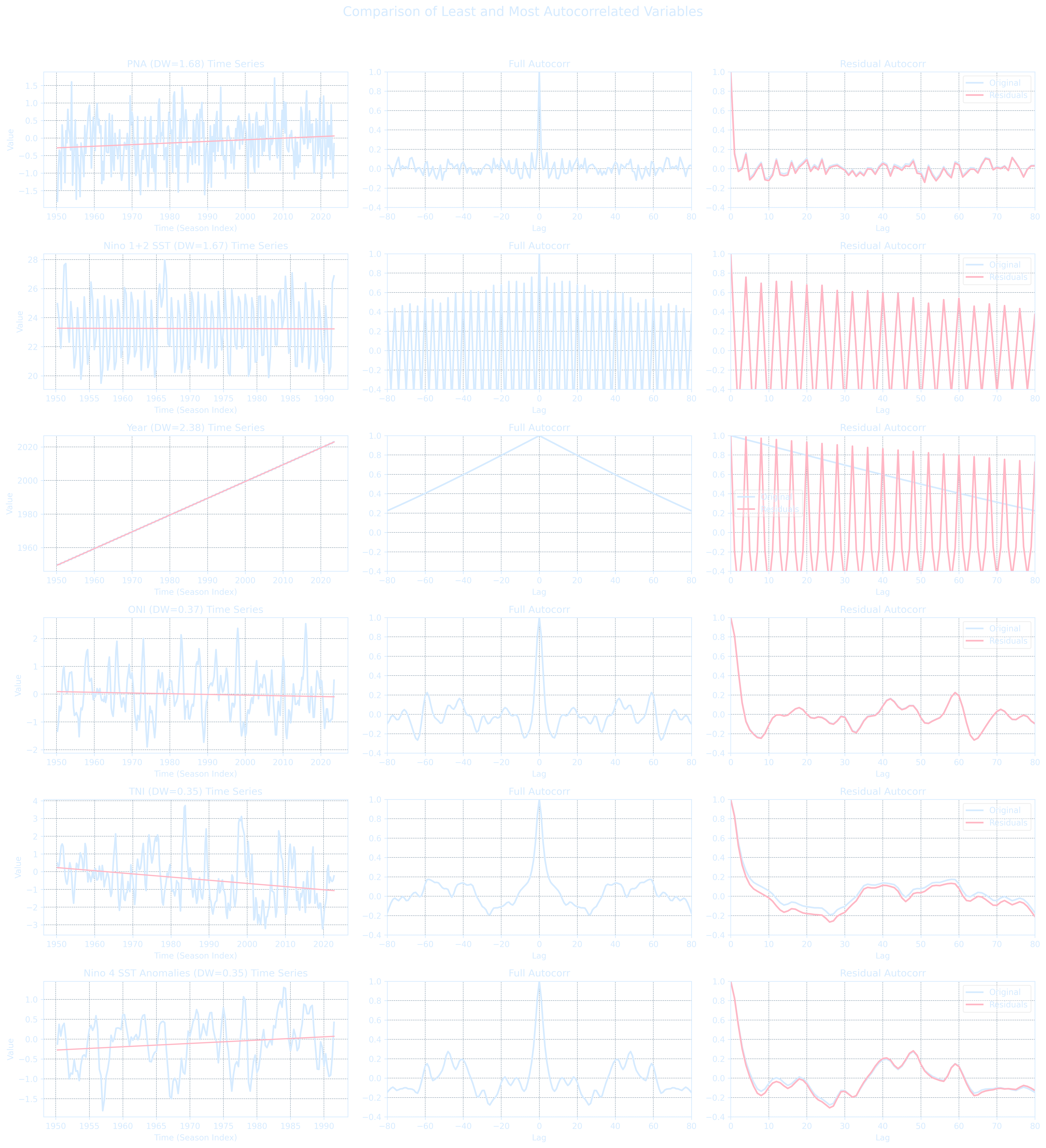
Noise
This is how the spectrum is supposed to look like in paleoclimate studies :-)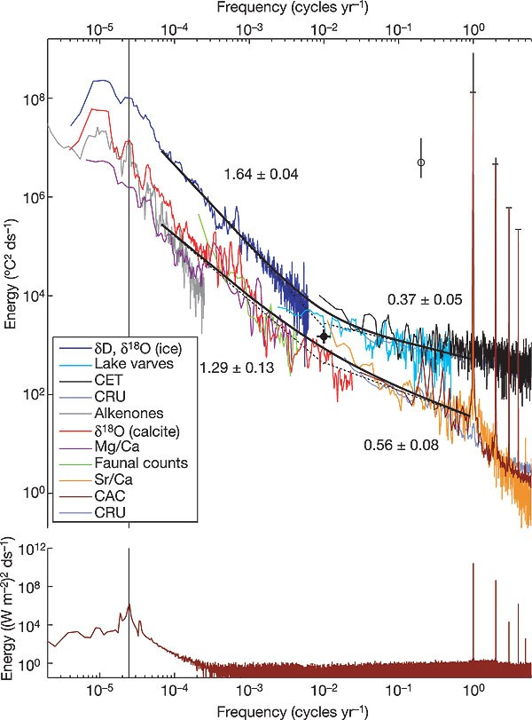
- A direct computation of the DFT requires $O(N^2)$ operations for a sequence of length $N$. For example, if $N = 1024$, then $N^2 \approx 10^6$.
- FFT reduces this cost dramatically to $O(N \log N)$. For $N = 1024$, $N \log N \approx 3000$
The figure uses the log-log scale that allows us to see detail at both large and small values.
series1_amoc = df1['AMOC_40N'].dropna()
series2_amoc = df2['AMOC_40N'].dropna()

# FFT-based spectrum function (frequency domain)
def compute_manual_spectrum(series, n=None):
    if n is None:
        n = len(series)
    series = series[:n]
    I = np.abs(np.fft.fft(series))**2 / n
    P = (4 / n) * I[:n // 2]
    f = np.arange(n // 2) / n
    return f[1:], P[1:]  # skip zero frequency

# Compute FFT spectra using full series
f1_amoc, p1_amoc = compute_manual_spectrum(series1_amoc)
f2_amoc, p2_amoc = compute_manual_spectrum(series2_amoc)

plt.figure(figsize=(8, 6), dpi = 300)
plt.loglog(f1_amoc, p1_amoc, label='CESM AMOC')
plt.loglog(f2_amoc, p2_amoc, label='Guido AMOC', color='red')
plt.xlabel("Frequency (log scale)")
plt.ylabel("Power (log scale)")
plt.title("Comparison of AMOC Spectra")
plt.legend()
plt.grid(True, which='both', linestyle='--', color = '#d6ebff')
plt.tight_layout()
plt.show()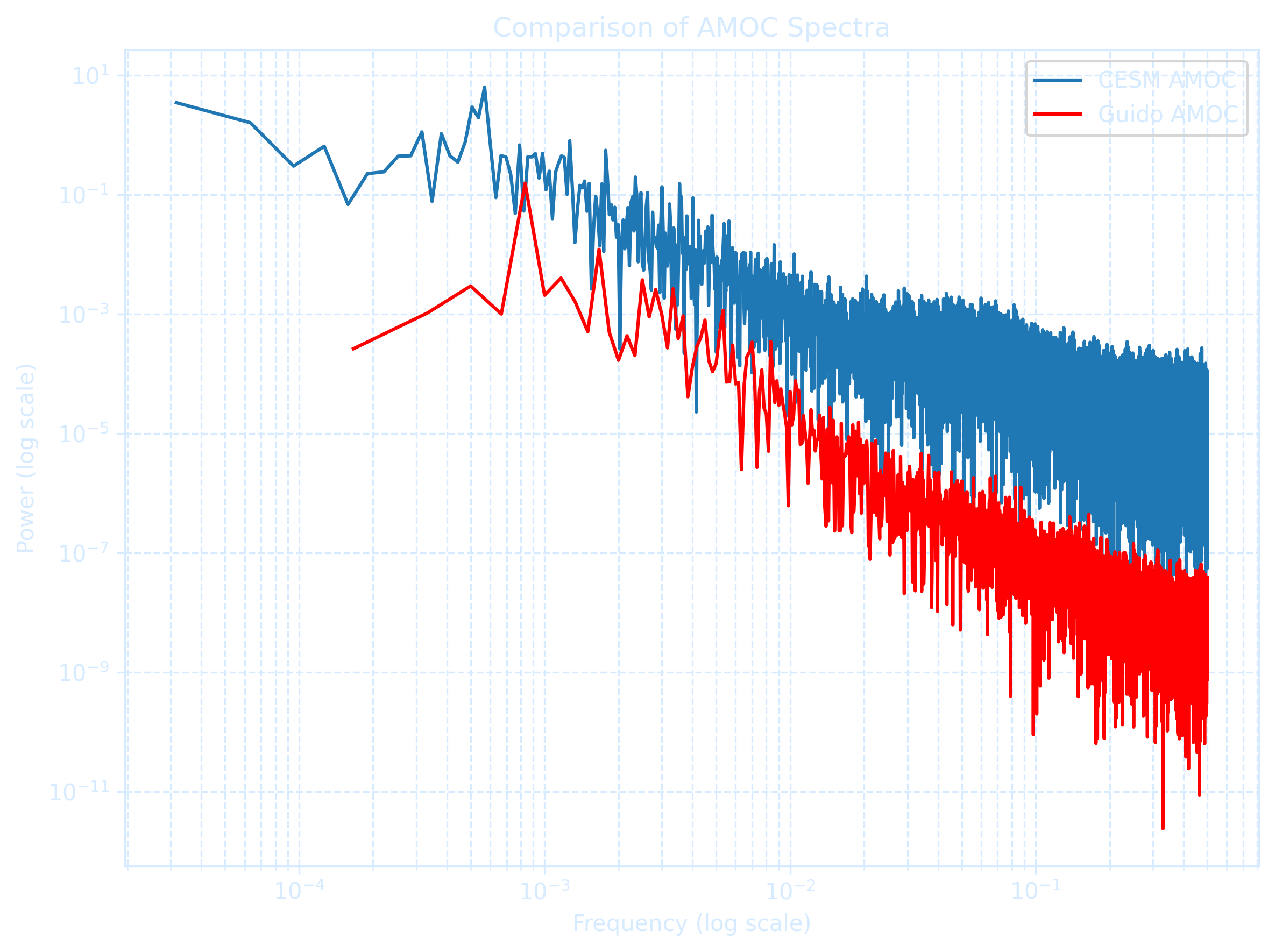
There are several other methods to chose from depending on the characteristics of your data.
| Method | Math Operation | Good for | Bad for |
|---|---|---|---|
| Log | ln(x) log10(x) |
Right skewed data log10(x) is especially good at handling higher order powers of 10 (e.g., 1000, 100000) |
Zero values Negative values |
| Square root | x1/2 | Right skewed data | Negative values |
| Square | x² | Left skewed data | Negative values |
| Cube root | x1/3 |
Right skewed data Negative values |
Not as effective at normalizing as log transform |
| Reciprocal | 1/x | Making small values bigger and big values smaller |
Zero values Negative values |
Red Noise Model
A red noise time series is defined as an autoregressive process where each value depends on the previous value and a white noise term:
\[x(t) = a \cdot x(t - \Delta t) + b \cdot \epsilon(t)\]
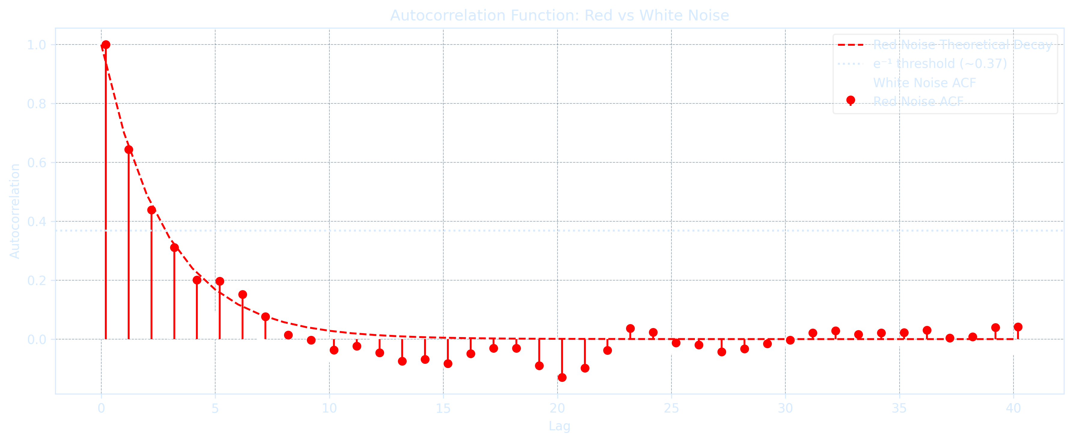
x[t] = a * x[t - dt] + b * epsilon[t]Measure the linear correlation between adjacent time steps, indicating memory in the signal. Multiply both sides of the red noise equation by \(x(t - \Delta t)\) and take the time average to get:
\[\rho(\Delta t) = a\]
rho_lag1 = anp.corrcoef that computes the Pearson correlation coefficient matrix between one or more datasets:
rho_lag1 = np.corrcoef(x[:-1], x[1:])[0, 1]\(
x(t) = a \cdot x(t - \Delta t) + b \cdot \epsilon(t)
\)
\(\Rightarrow
x(t + \Delta t) = a \cdot x(t) + b \cdot \epsilon(t + \Delta t)
\) ,
\(
x(t + 2\Delta t) = a \cdot x(t - \Delta t) + b \cdot \epsilon(t + 2\Delta t)
\)
\(\Rightarrow
\overline{x(t) \cdot x(t + 2\Delta t)} = \overline{a \cdot x(t) \cdot x(t - \Delta t)} + \overline{b \cdot x(t) \cdot \epsilon(t + 2\Delta t)}
\)
Drop the last term uncorrelated noise \(\Rightarrow\) \(\rho(2\Delta t) = a \cdot \rho(\Delta t)\)
Substitute \(a = \rho(\Delta t)\) \(\Rightarrow\) \(\boxed{\rho(2\Delta t) = \rho(\Delta t)^2}\)
The lag-2 autocorrelation of a red-noise time series is equal to the lag-1 autocorrelation squared.
For any integer lag \(n\), the red noise autocorrelation follows:
\[\rho(n\Delta t) = \rho(\Delta t)^n\]
rho_n = rho_1 ** n[Pf] Using Mathematical Induction,
Base Case (n = 1): \(\rho(\Delta t) = \rho(\Delta t)^1\)
Assume for some integer \(k \geq 1\), the autocorrelation at lag \(k\Delta t\) satisfies\(\rho(k\Delta t) = \rho(\Delta t)^k\)
For \(k+1\): \(\rho((k+1)\Delta t) = a \cdot \rho(k\Delta t)\)
\(\Rightarrow \rho((k+1)\Delta t) = \rho(\Delta t) \cdot \rho(\Delta t)^k = \rho(\Delta t)^{k+1}\)
\(\therefore\) For all integers \(n \geq 1\),
\(
\boxed{\rho(n\Delta t) = \rho(\Delta t)^n}
\)
The e-folding time scale \(T_e\) shows how long it takes for autocorrelation to decay to \(1/e \approx 0.368\) of the original value \(\rho(0) = 1\):
\[T_e = -\frac{\Delta t}{\ln(a)}\]
Te = -dt / np.log(a)Red noise autocorrelation also decays exponentially with lag time:
\[\rho(n\Delta t) = e^{-n\Delta t / T_e}\]
rho_n = np.exp(-n * dt / Te)A white noise process is a special case of red noise process \(x(t) = a \cdot x(t - \Delta t) + b \cdot \epsilon(t)\) with the autocorrelation disappears:
\[\rho(\Delta t > 0) = 0 \text{ or simply } a = 0\]
This means that white noise has zero autocorrelation, implying no memory of previous values. In geophysical contexts, white noise is commonly assumed to follow a normal distribution.
x[t] = b * epsilon[t] # when a = 0import numpy as np
import pandas as pd
import matplotlib.pyplot as plt
from scipy.stats import linregress
# Load data
df = pd.read_csv('ENSO.csv')
numeric_cols = df.select_dtypes(include='number').columns
# Container for results
noise_results = []
# Loop over variables
for var in numeric_cols:
series = df[var].dropna().values
if len(series) < 120:
continue
# Seasonal average (3-month)
series = series[:(len(series) // 3) * 3]
seasonal = np.mean(series.reshape(-1, 3), axis=1)
# Anomaly
x = seasonal - np.mean(seasonal)
# Lag-1 autocorrelation
r1 = np.corrcoef(x[:-1], x[1:])[0, 1]
# e-folding time
if r1 > 0:
Te = -1 / np.log(r1)
else:
Te = np.nan
# Store
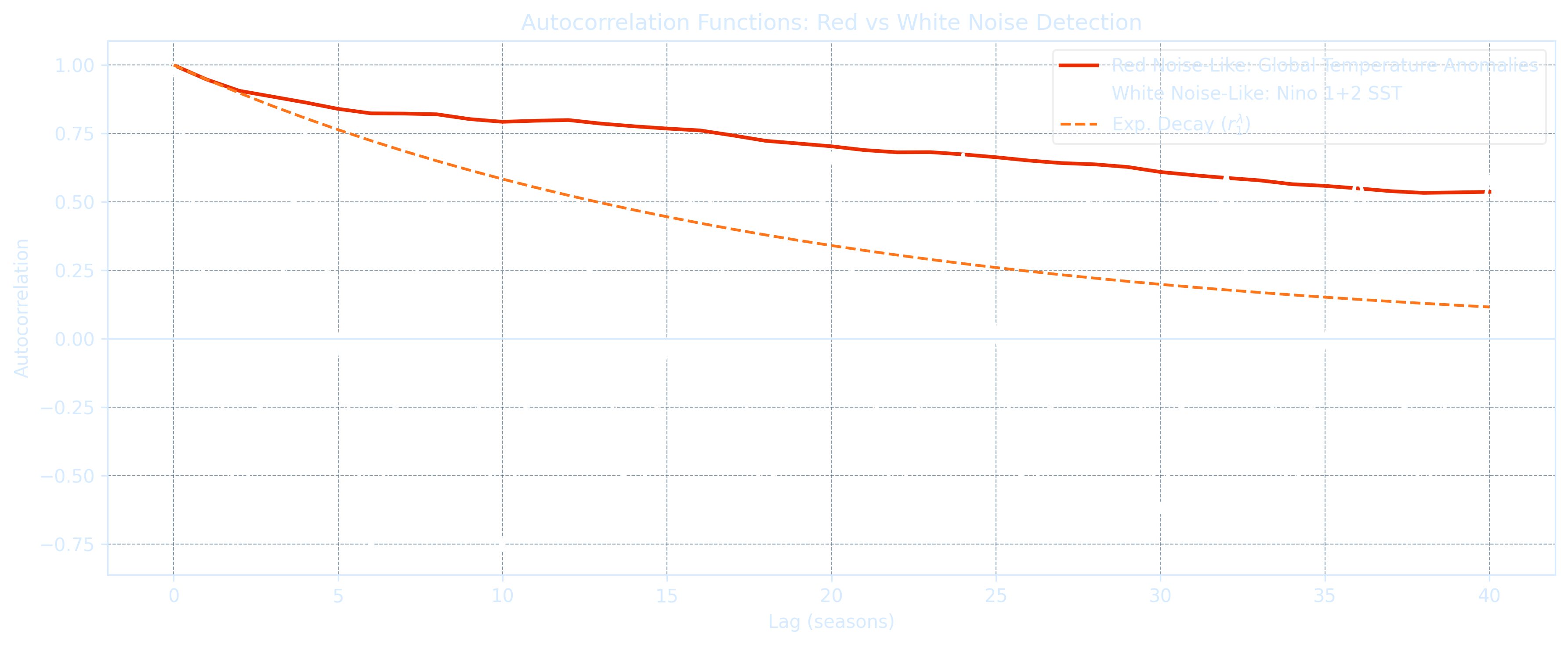
noise_results.append((var, r1, Te, seasonal))
# Sort by r1 (highest to lowest memory)
sorted_noise = sorted(noise_results, key=lambda x: x[1], reverse=True)
print("\nTop 5 Red-Noise-like Variables (highest lag-1 autocorr):")
for var, r1, Te, _ in sorted_noise[:5]:
print(f"{var:25s} r1 = {r1:.3f} Te = {Te:.2f} seasons")
print("\nTop 5 White-Noise-like Variables (lowest lag-1 autocorr):")
for var, r1, Te, _ in sorted_noise[-5:]:
print(f"{var:25s} r1 = {r1:.3f} Te = {Te:.2f} seasons")
# Define ACF function
def acf(x, max_lag=40):
x = x - np.mean(x)
n = len(x)
result = np.correlate(x, x, mode='full') / (n * np.var(x))
return result[n-1:n+max_lag]
# Plot settings
max_lag = 40
if sorted_noise[0][0].lower() == 'year':
red_var, _, _, red_data = sorted_noise[1]
else:
red_var, _, _, red_data = sorted_noise[0]
white_var, _, _, white_data = sorted_noise[-1]
lags = np.arange(max_lag + 1)
acf_red = acf(red_data, max_lag)
acf_white = acf(white_data, max_lag)
fig, ax = plt.subplots(figsize=(12, 5), dpi=300)
fig.patch.set_alpha(0.0)
ax.set_facecolor('none')
# Lines
ax.plot(lags, acf_red, label=f'Red Noise-Like: {red_var}', color='#EC2D01', lw=2)
ax.plot(lags, acf_white, label=f'White Noise-Like: {white_var}', color='#eeeeee', lw=2)
ax.plot(lags, [acf_red[1]**l for l in lags], '#FF7518', label=r'Exp. Decay ($r_1^\lambda$)', lw=1.5, linestyle='--')
ax.axhline(0, color='gray', lw=1)
# Grid and ticks
ax.grid(True, linestyle='--', linewidth=0.5, color='#3c5c78', alpha=0.6)
ax.tick_params(colors="#d6ebff")
for label in ax.get_xticklabels() + ax.get_yticklabels():
label.set_color("#d6ebff")
# Labels and title
ax.set_xlabel('Lag (seasons)', color='#d6ebff')
ax.set_ylabel('Autocorrelation', color='#d6ebff')
ax.set_title('Autocorrelation Functions: Red vs White Noise Detection', color='#d6ebff')
# Spines and legend
for spine in ax.spines.values():
spine.set_color("#d6ebff")
legend = ax.legend()
for text in legend.get_texts():
text.set_color("#d6ebff")
plt.tight_layout()
plt.show()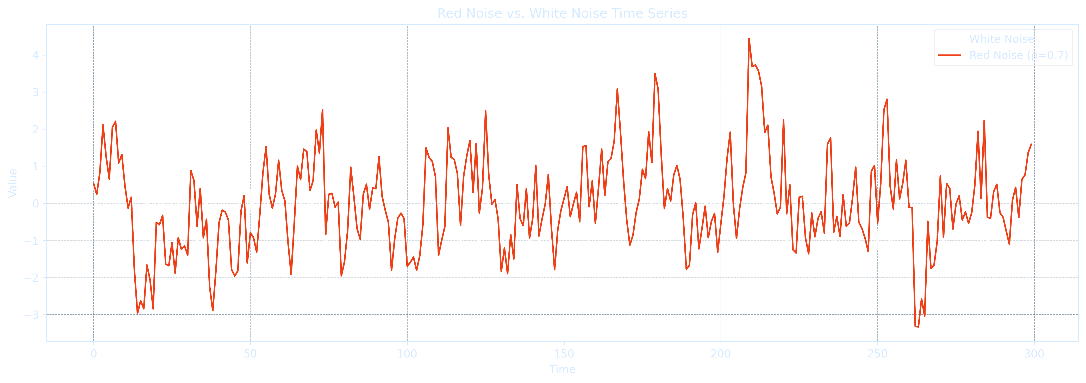
import numpy as np
import pandas as pd
import matplotlib.pyplot as plt
from scipy.stats import linregress

# Load data
df = pd.read_csv('ENSO.csv')
numeric_cols = df.select_dtypes(include='number').columns

# Container for results
noise_results = []

# Loop over variables
for var in numeric_cols:
    series = df[var].dropna().values
    if len(series) < 120:
        continue

    # Seasonal average (3-month)
    series = series[:(len(series) // 3) * 3]
    seasonal = np.mean(series.reshape(-1, 3), axis=1)

    # Anomaly
    x = seasonal - np.mean(seasonal)

    # Lag-1 autocorrelation
    r1 = np.corrcoef(x[:-1], x[1:])[0, 1]

    # e-folding time (in units of seasons)
    if r1 > 0:
        Te = -1 / np.log(r1)
    else:
        Te = np.nan

    # Store
    noise_results.append((var, r1, Te, seasonal))

# Sort by r1 (highest to lowest memory)
sorted_noise = sorted(noise_results, key=lambda x: x[1], reverse=True)

print("\nTop 5 Red-Noise-like Variables (highest lag-1 autocorr):")
for var, r1, Te, _ in sorted_noise[:5]:
    print(f"{var:25s}  r1 = {r1:.3f}  Te = {Te:.2f} seasons")

print("\nTop 5 White-Noise-like Variables (lowest lag-1 autocorr):")
for var, r1, Te, _ in sorted_noise[-5:]:
    print(f"{var:25s}  r1 = {r1:.3f}  Te = {Te:.2f} seasons")

# Define ACF function
def acf(x, max_lag=40):
    x = x - np.mean(x)
    n = len(x)
    result = np.correlate(x, x, mode='full') / (n * np.var(x))
    return result[n-1:n+max_lag]

# Plot settings
max_lag = 40
if sorted_noise[0][0].lower() == 'year':
    red_var, _, _, red_data = sorted_noise[1]
else:
    red_var, _, _, red_data = sorted_noise[0]
white_var, _, _, white_data = sorted_noise[-1]

lags = np.arange(max_lag + 1)
acf_red = acf(red_data, max_lag)
acf_white = acf(white_data, max_lag)

fig, ax = plt.subplots(figsize=(12, 5), dpi=300)
fig.patch.set_alpha(0.0)
ax.set_facecolor('none')

# Lines
ax.plot(lags, acf_red, label=f'Red Noise-Like: {red_var}', color='#EC2D01', lw=2)
ax.plot(lags, acf_white, label=f'White Noise-Like: {white_var}', color='#ffffff', lw=2)
ax.plot(lags, [acf_red[1]**l for l in lags], '#FF7518', label=r'Exp. Decay ($r_1^\lambda$)', lw=1.5, linestyle='--')
ax.axhline(0, color='#d6ebff', lw=1)

# Grid and ticks
ax.grid(True, linestyle='--', linewidth=0.5, color='#3c5c78', alpha=0.6)
ax.tick_params(colors="#d6ebff")
for label in ax.get_xticklabels() + ax.get_yticklabels():
    label.set_color("#d6ebff")

# Labels and title
ax.set_xlabel('Lag (seasons)', color='#d6ebff')
ax.set_ylabel('Autocorrelation', color='#d6ebff')
ax.set_title('Autocorrelation Functions: Red vs White Noise Detection', color='#d6ebff')

# Spines and legend
for spine in ax.spines.values():
    spine.set_color("#d6ebff")

legend = ax.legend()
legend.get_frame().set_alpha(0.3)
for text in legend.get_texts():
    text.set_color("#d6ebff")

plt.tight_layout()
plt.show()
Top 5 Red-Noise-like Variables (highest lag-1 autocorr): Year r1 = 1.000 Te = 4780.78 seasons Global Temperature Anomalies r1 = 0.958 Te = 23.06 seasons TNI r1 = 0.837 Te = 5.61 seasons Nino 4 SST Anomalies r1 = 0.830 Te = 5.36 seasons MEI.v2 r1 = 0.818 Te = 4.99 seasons Top 5 White-Noise-like Variables (lowest lag-1 autocorr): SOI r1 = 0.671 Te = 2.51 seasons Nino 3.4 SST r1 = 0.591 Te = 1.90 seasons Nino 3 SST r1 = 0.390 Te = 1.06 seasons PNA r1 = 0.170 Te = 0.56 seasons Nino 1+2 SST r1 = 0.157 Te = 0.54 seasons
The Climate Casino
Stochastic methods are a crucial area in contemporary climate research and are increasingly being used in comprehensive weather and climate prediction models as well as reduced order climate models.No model lasts forever. Even if the data quality is good, the model itself will begin to degrade.